"Fuel Them For..." — An ORIJEN Brand Awareness Campaign
A three-week sprint to reposition a premium pet food brand for the outdoor generation
Role
Lead Consumer Analyst | Co-Creative Lead
Industry
CPG | Pet Food
Duration
6 Weeks

The Client & The Challenge
ORIJEN is a premium pet food brand operating at the top of the kibble category — whole-prey nutrition, carefully sourced ingredients, and a price point that reflects both. They came to the Leeds School of Business with a real business problem and asked students to solve it.
The ask: help ORIJEN evolve from a premium kibble brand into a leading outdoor lifestyle brand — the first choice for active owners and their adventurous dogs. They didn't just want to win the pet food aisle. They wanted to own a way of life.
The challenge was two-fold. First, ORIJEN's primary competitors Blue Buffalo, Royal Canin, and the growing wave of refrigerated, real-ingredient brands like The Farmer's Dog were all staking their own premium claims. Second, and more critically, ORIJEN's existing messaging leaned heavily on technical credibility: food scientists, proprietary "Wholeprey Nutrition" language, and bold performance claims. The science was real. But for a consumer grabbing a bag off the shelf, none of it translated into something they could feel.
The Insight
Our team's central finding was a messaging gap between what ORIJEN was saying and what their target consumer needed to hear.
Their ideal future consumer thought in experiences, and ORIJEN spoke credentials.
"Wholeprey Nutrition" means nothing to someone who doesn't already know what it means. The insight wasn't that ORIJEN needed better science communication. It was that they needed to stop leading with the science, and start leading with what the science enables.
The secondary insight was relational. The consumer ORIJEN wanted to reach didn't own a pet, they had a best friend. A dog that went everywhere, did everything, and deserved to be treated accordingly. Premium nutrition wasn't an indulgence for this person. It was an expression of how much they cared.
From these two truths, the campaign concept emerged: "Fuel Them For..."
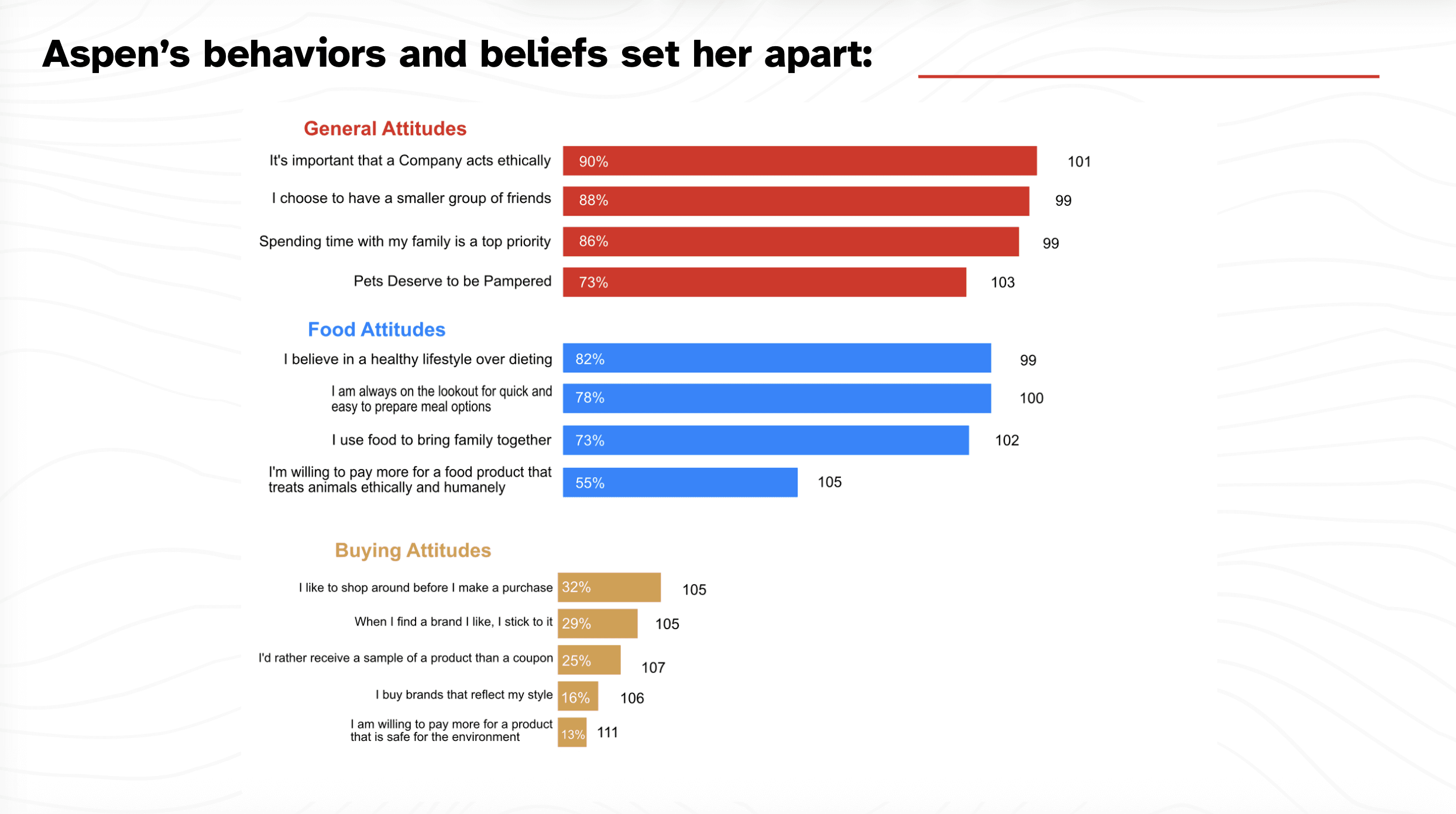
The Consumer — Meet Aspen
To ground the campaign in a real human truth, I developed Aspen — a vivid consumer persona built from ORIJEN's existing audience data, their target demographic ambitions, and syndicated consumer research.
Aspen is the campaign's north star: an active, high-net-worth millennial dog owner who treats her pet as family, prioritizes quality over convenience, and sees her outdoor lifestyle as a core part of her identity. She already believes her dog deserves the best, and she is looking for a brand that speaks her language.
Aspen gave the entire campaign a human anchor. Every choice ran through one question: does this feel right for her?
The Creative
The "Fuel Them For..." concept was built to be open-ended by design, it was a campaign line that could flex across moments, seasons, and stories. Fuel them for the summit. Fuel them for the muddy trail. Fuel them for the years ahead. The line invited consumers into the brand rather than lecturing them about it.
I created the campaign's hero imagery to bring this visual language to life. The centerpiece: a golden retriever standing alone on a mountain ridge, looking out over a sweeping alpine vista with clouds rolling below. the core image was a dog at the edge of something vast, exactly where ORIJEN's consumer imagines their best friend belongs.
The typographic treatment layered the campaign's emotional range across the sky: Play. Love. Life. Adventure. Exploration. — words that faded in and out of the background while "Fuel Them For..." anchored the frame in ORIJEN's signature red. The tagline isn't a single statement, it's an open invitation that means something different for every dog, every owner, and every trail.
The result didn't look like a pet food ad. It looked like an outdoor lifestyle brand.

The Pitch & Outcome
The campaign was developed in three weeks from brief to final presentation, and pitched directly to Directors at ORIJEN headquarters.
We did not win. But the feedback was specific and constructive — the imagery, the strategic reasoning, and the overall campaign direction were praised. And For a three-week sprint with a real client in the room, the work held up.
What I Learned
The most valuable thing this project reinforced was something I already believed: consumers don't buy products, they buy what products make possible. ORIJEN had extraordinary science behind their food. Our job wasn't to explain it better, it was to translate it into a feeling.
**All Logos are used non-commerically, in an educational context and are sole property of ORIJEN Pet Food Brands, A division of MARS.


Other projects

Pronoia Group — Bilingual Web Design & Brand Refresh
From Formality to Function — Rebuilding a Brand's Digital Voice in Two Languages

Aqua Nova Skin Solutions — Brand Identity & Launch
From Blank Page to Booked Solid

Typeform — Organizational Innovation at Canvas Credit Union
Modernizing Canvas's Form Experience

Canvas Credit Union — Employee Apparel Store
Rebuilding Canvas's Employee Apparel Program From the Ground Up

Creative Sprint: "LUCID" - A Short Film by Andrew Perper
Helping to Bring Andrew's Vision to Life